PROBLEM
Creative studios can look interchangeable. How can AH express both its artistic range and the strategic discipline behind it?
Human expression. Strategic discipline.
One recognizable language.
Creative studios can look interchangeable. How can AH express both its artistic range and the strategic discipline behind it?
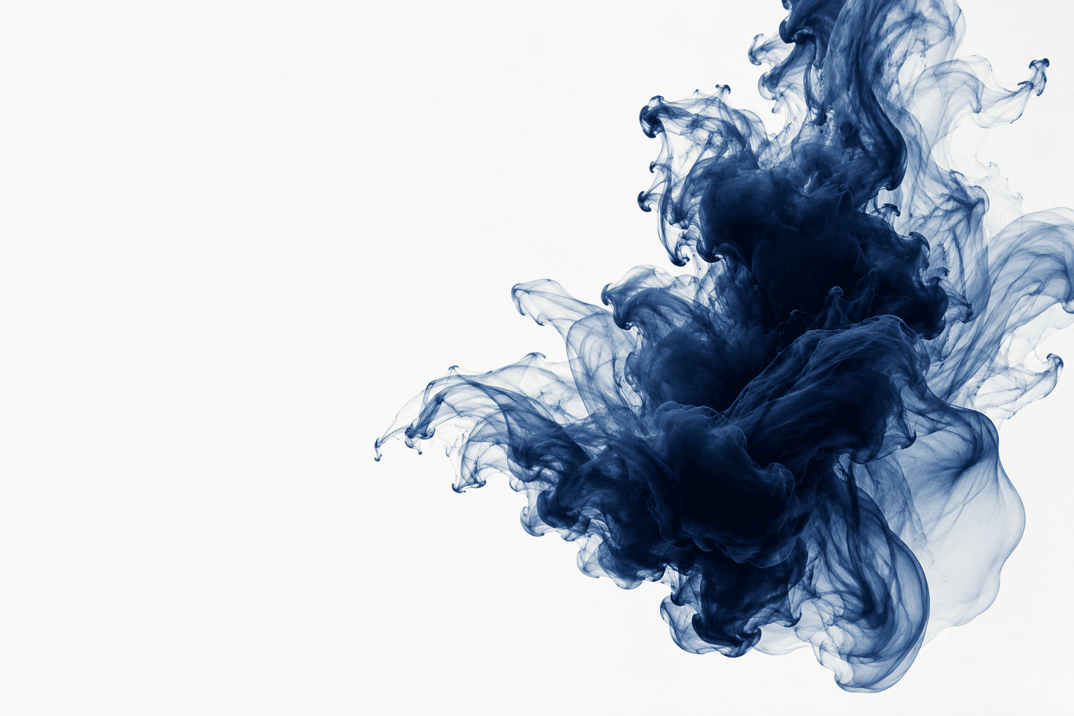
Expression becomes more meaningful when a clear structure gives it direction. Organic ink and a rational grid make that relationship visible.
Ink represents humanity and ideas. Fluid represents context. Motion signals transformation. Convergence signals a coherent identity.
One indigo pigment field, a consistent grotesk type family, a responsive grid and interaction principles connect the website, identity and design tools.
This self-initiated concept documents a visual direction through pigment imagery, typography, color, and a written rationale. It has not been launched as a client project; no conversion, revenue or user-study results are claimed.